How do I adapt existing responsive web site to display Leaflet maps?
Geographic Information Systems Asked by Horia Popa on January 12, 2021
My website works well on different devices but it seems that only works with images, although I would like to show other media, like Leaflet maps and videos.

Just about all pages are laid out on a grid using classes.
Here is the current html code for one image:
<div class="container">
<div class="row">
<div class="col-sm-4">
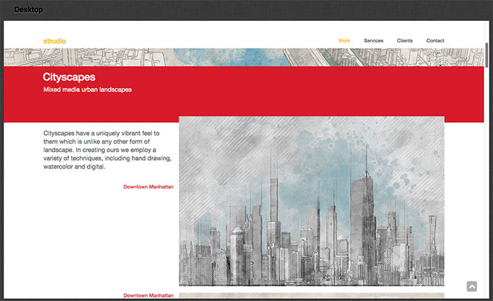
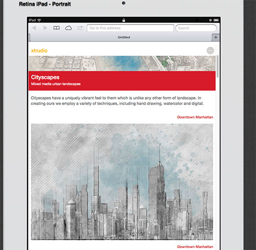
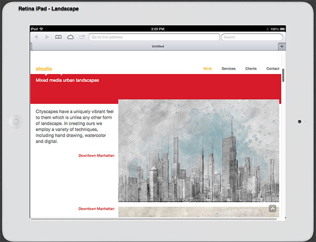
<p class="lead">Cityscapes have a uniquely vibrant feel to them which is unlike any other form of landscape. In creating ours we employ a variety of techniques, including hand drawing, watercolor and digital.</p>
<br><p class="h5 text-right palette-coral">Downtown Manhattan</p>
<p></p>
</div>
<div class="col-sm-8 overlap-sm">
<p>
<span class="picturefill-medium" data-picture data-alt="Downtown Manhattan">
<span data-src="../../img/work/cityscapes/lowerManhattan01_298.jpg"></span>
<span data-src="../../img/work/cityscapes/lowerManhattan01_482.jpg" data-media="(min-width: 480px)"></span>
<span data-src="../../img/work/cityscapes/lowerManhattan01_644.jpg" data-media="(min-width: 992px)"></span>
<noscript>
<img src="../..../../img/work/cityscapes/lowerManhattan01_298.jpg" alt="Downtown Manhattan">
</noscript>
</span>
</p>
</div>
</div>
</div>
Each image has three size versions and depending on the width of the viewer’s screen the right one is loaded.
In the past I tried to display videos in the same framework (span) but I was not able, so I settled for screen shots with links to an external page to see the video.
Now I want to be able to display Leaflet maps on the same grid but I tried various html code and it didn’t work.
For example, I tried the code below, but regardless of the width of the screen the div with 298px is loading:
<span class="picturefill-medium" data-picture data-alt="Downtown Manhattan">
  <span><div id="mapid" style="width:298px; height: 298px;"></div></span>
  <span  data-media="(min-width: 480px)"><div id="mapid" style="width:482px; height:482px;"></div></span>
  <span  data-media="(min-width: 992px)"><div id="mapid" style="width:644px; height: 644px;"></div></span>

</span>
Any advice?
One Answer
You need to define an absolute height on the parent element and then you can set height: 100% on the map container:
.wrapper {
  height: 300px;
}

#map {
  height: 100%;
}
So in your case the HTML should look like this:
<span style="width:298px; height: 298px;"><div id="mapid" style="height: 100%;"></div></span>
If you encounter weird things when you change orientation of the device, you should call invalidateSize() on the map.
Answered by Stefan on January 12, 2021
Add your own answers!
Ask a Question
Get help from others!
Recent Answers
- Joshua Engel on Why fry rice before boiling?
- Jon Church on Why fry rice before boiling?
- Lex on Does Google Analytics track 404 page responses as valid page views?
- haakon.io on Why fry rice before boiling?
- Peter Machado on Why fry rice before boiling?
Recent Questions
- How can I transform graph image into a tikzpicture LaTeX code?
- How Do I Get The Ifruit App Off Of Gta 5 / Grand Theft Auto 5
- Iv’e designed a space elevator using a series of lasers. do you know anybody i could submit the designs too that could manufacture the concept and put it to use
- Need help finding a book. Female OP protagonist, magic
- Why is the WWF pending games (“Your turn”) area replaced w/ a column of “Bonus & Reward”gift boxes?